Matt Rebholz

My name is Matt Rebholz and I am an artist and a professor of printmaking and drawing based in Austin, Texas. My recent work has to do with the intersections of science fiction, science fact and the spectrum of utopianism/dystopianism that those intersections represent. My work is inspired by comics, art historical figures such as Albrect Dürer, and technical illustration.

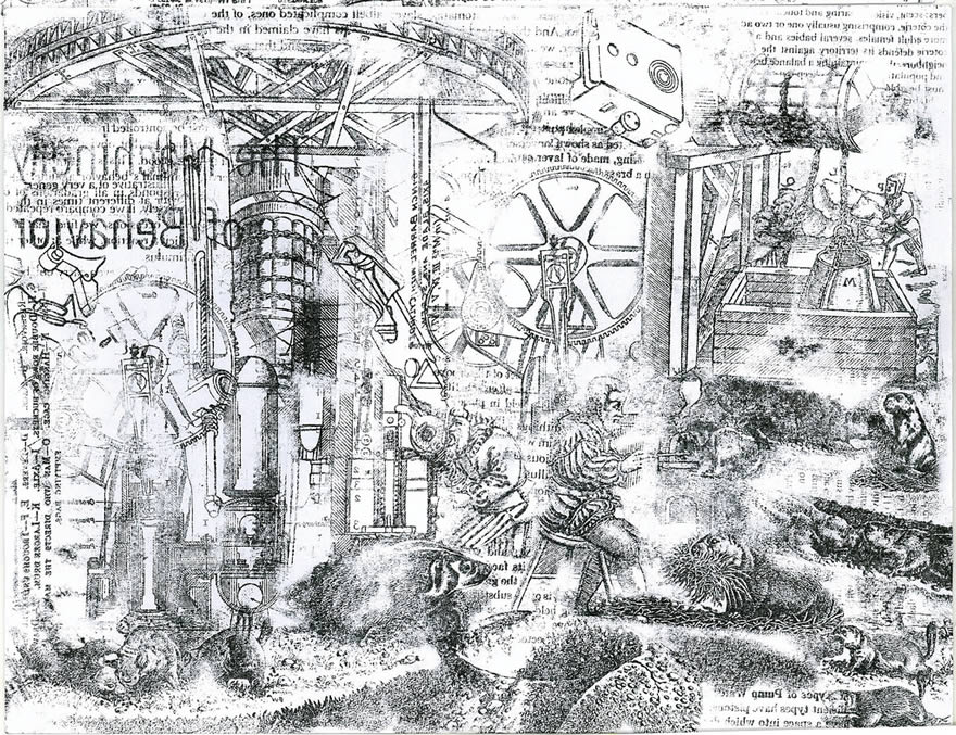
Most of these pieces are etchings, a 500 year old printmaking process. It involves hand drawing the images onto a copper plate, then submerging the plate in an acid that chemically etches the linework into the metal. Ink is then driven into the lines and it is transferred to paper by passing it under the steel roller of an etching press. I produce my prints in limited editions (typically between 5 and 20 impressions), and while very similar, each impression is unique. For more on how prints are made, please check out this excellent interactive cartoon produced by the Museum of Modern Art:

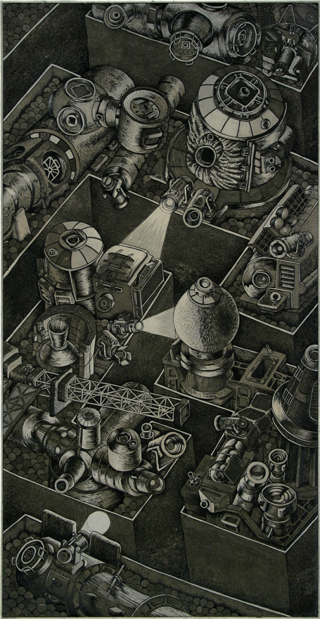
This piece explores the concept of the Arcology, a hybridization of the words architecture and ecology that refers to a self-contained, self-sufficient living structure. In this etching, rival arcologies constructed from various spacecraft components are densely packed together in a vertical environment reminiscent of an urban landscape. It is unclear to me whether they are cooperating or squaring off against each other.

Continue reading

Load More Comments Commenting is closed.
Featured Designs from the NeatoShop:


Michael Renouf

By Michael Renouf: I’m a Practitioner of Cartoonism with a Licence to Cross Wires, mostly working in educational publishing in London, UK. I’ve been freelance for a long time, with periodic interruptions for child-minding, logo-designing and animating maps for local government presentations. In danger of becoming a Theoretical Cartoonist, instead of a practitioner, I started a drawing-a-day-for-a-year blog in 2007 called Non-Stick Plans. The year is long ago up but I’m still posting the odd drawing - some of them very odd. Below is a selection of images, mostly from that very blog.

Vermicellist - My work could be described as ‘warm’ rather than ‘cool’, so I’m waiting for a time when warm is the new cool. My influences include Pericle Luigi Giovannetti, William Heath Robinson and Gerard Hoffnung; all ‘warm’ cartoonists. My main currency is puns, either visual or verbal (like this drawing), occasionally both.

Continue reading

Load More Comments Commenting is closed.

Joe Holliday

By Joe Holliday: As the family story goes, I got my last name because my dad robbed a bank and was trying to elude the authorities. When I scattered his ashes at Ayers Rock I came to the conclusion that there are crossovers of past, present, future and all points of space. My work is an attempt to show this without being a hippy about it. This is why I use found objects and images, layered images, randomization, and dead, living and non-living materials.

I currently work for the Rogue Artists Ensemble and will be attending Cal Arts in fall. My goal is simply to destroy the universe.

The Machinery of Behavior
The images used in this are taken from alchemical prints, gun manuals, and prairie dog diagrams. This is an image of behavioral sciences and their relation to subconscious expression.

Continue reading

Load More Comments Commenting is closed.

Alex Eben Meyer

By Alex Eben Meyer: hi, i am an illustrator living and working in sunny greenpoint brooklyn, an area of nyc which is fast turning into a weed garden of illustrators (hell, my studio is in an old pencil factory (yeah i know, illustrator, pencil factory, it's a bit obvious, but the space and the people are great). in my work, i strive for accessibility, humor and fun. i want viewers to smile and enjoy, and then look for the greater details, thinking and occasional snark. i'm not really one for grandiose artist statements, i'd rather have you look, and enjoy.

hp artist series wallpapers: hp approached me to be involved in their artist series of backgrounds for the 2010 hp laptop series. i have a great fondness for sketchbooks and drawing in coffee shops (see below) and they were looking for that feeling of experimentation and energy for these backgrounds.

Continue reading

Load More Comments Commenting is closed.

Marianne Williams

By Marianne Williams: I'm a photographer living in Los Angeles, CA. I work shooting film stills and various happenings, meanwhile hacking an ongoing series of portraits of LA music and artist friends called LA Daze. Candy colored images combine elements of the subject's work and personality with pop culture, historical and religious iconography, exposed artifice, and movie references. Romak has helped a lot with brilliant make up skills and I get a lot of my props from Dapper Cadaver, it's always a collaboration. I print an annual magazine style portfolio of the project and hope to release it as an art book at some point.

1. Cindergarden dons half porcelain doll face and half death mask inspired by traditional Mexican Dios de los Muertes dolls. A skeleton arm encircles her neck.

Continue reading

Load More Comments Commenting is closed.

Ugo Nonis

By Ugo Nonis: Born and raised in Paris, I moved to the United States in 2000, I lived in NYC then recently moved to LA. My process is very straight forward, I grab a canvas, some markers and start. Most of the time I think about people I know or situations I've encountered and represent them in a way only I can recognize. While painting I follow my hand and let it guide me, after a while I look at the work and I see how to move forward making shapes I love. I have rules that I follow and sometimes break. I like to try to paint on different surfaces as each surface feels different, I am always looking for the smoothest one. I really enjoy the feeling of my hand sliding and creating lines.

My main inspiration is the people in my life. Every time I start a painting I think about someone I know and the way we are related. I paint my ideas and feelings about that person then after a while I just let my mind wander and let other outside elements influence me. I also paint my wishes and use that time to daydream. As far as visual inspiration I can't really tell you because I really don't know where my art comes from, I never went to art school or thought about what type of art I wanted to do. My roomate in NYC (Brian Sensebe) is a super talented painter, he had an empty canvas, I grabbed it and theses lines came out of nowhere. I am sure a million visual things inspire me but I am not conscious about it.

110th
This is oil paint markers on canvas, it's the first time I used an accent of color. The meaning of this painting is mine to keep but as with all my work I love to let people find their own and let their imagination travel in the painting.

Continue reading

Load More Comments Commenting is closed.

Jaime "Kalapusa" Margary

My name is Jaime Margary, also known as Kalapusa. I am known mostly as a sculptor and an illustrator, but I enjoy learning and practicing other mediums and doing as well as I can to master them and find what visions they may bring that cannot be found in any other. My artistic urge is fueled by an intense curiosity to see the end result of an idea brought to life. The projects I pick usually have a technical challenge I have not overcome before, to reap techniques that have a potential for projects I previously thought out of my league. I want to grow as an artist, expressing different styles reflecting different sides of myself and the way I see the world.

Piranha Plant and Vincent
My Piranha Plant sculpture with my dog, Vincent, standing guard. In creating it, I based my design on this question: Had it been based on a real living plant, what would it look like? I used clay, a strengthened wire skeleton and a special mix of acrylics to get the right appearance of flesh (particularly the inside of the mouth). During its creation, I documented the process for a video in which you can see the individual pieces being sculpted and painted before being put together.

Continue reading

Load More Comments Commenting is closed.

Christy Brooker

By Christy Brooker: I started tattooing in 1999 fresh out of High School. I can't remember a time when I didn't draw. Some of my first memories are of my sister and I doodling in church. After twelve years of working in some of the best tattoo shops in Missoula, Montana and Seattle, Washington I decided it was time for me to open my own studio and do it my way.

In 2009 I opened Damask Tattoo llc. I've created a spa style environment with antique furniture, light colors and brightly lit private tattoo rooms. Damask is in a discrete office building on top of Queen Anne hill in Seattle, alongside a naturopath, acupuncturists and massage therapists. I've also become very involved in the tattoo community in Washington. As director of the Women's Tattoo Forum I plan events and host a yearly art show that features all women tattoo artist from around the country. I'm also Treasurer of the Washington Association of Body Artists and serve on the advisory board for the Washington State Department of Licensing's Body Art Department helping to write rules and bring new legislation to improve the standards in my field.

In addition to tattooing I paint in oils and acrylics and am taking classes to improve my skills in these mediums. I love learning new techniques, tricks and tools in all of my art forms and am constantly looking for more knowledge that I can implement in them. Stop by the website, take a look and and drop us a line!

1. Al Capone portrait - There's always an attraction to the bad boys for us. This client has a whole sleeve based on the romanticized 1920's gangster and we couldn't do it right without All Capone.

Continue reading

Load More Comments Commenting is closed.

Peter Bowen

Hi, I'm Peter Bowen, an illustrator/graphic designer based in the UK. Between 2005 and April of this year I worked as a graphic designer at 55DSL, a sister brand to Diesel. I'm currently working freelance from my secret base in London.

Sometimes with a slightly dark edge, but always with a sense of humour, I work in a wide variety of styles and techniques, from airbrushed digital paintings to typography, hand-drawn characters, and anything in between.

It's Popeye quietly dozing in the afternoon sun. I figure he's pretty old by now, and just needs to take it easy every now and again. It troubles me you don't see him very much any more, so this is what I think he's up to.

Continue reading

Load More Comments Commenting is closed.

Stephen McCranie

Hi, I’m Stephen McCranie and I’m a cartoonist. It’s nice to meet you all on the internets here! My goal is to draw comics that make people happy.

My latest attempt to make people happy is a calvin-and-hobbes-esque comic strip called Mal and Chad that updates Monday thru Friday at MalandChad.com. Here’s the main cast of characters:

I’ve been cartooning since I was 5 years old. I didn’t know how to write at the time, so I scribbled out comics on printer paper and had my mom fill in the speech bubbles for me. Even though I couldn’t read my own comics, for some reason I just had to draw them! I guess I caught the comics bug early, and I haven’t been the same since.

I currently chronicle my obsession with comics as well as general life happenings in a journal comic. I’ve also got a bunch of extra comics and art work on my gallery website, Doodle Alley. My current comic strip, Mal and Chad, is featured on the digital syndication site GoComics, along with strips like Foxtrot, Garfield, and Calvin and Hobbes. I’m also currently working to complete a children’s graphic novel based off the Mal and Chad comic strip, which will hopefully be printed in the summer of 2011 by Philomel Books, an imprint of Penguin.

Here’s some of my work:
Continue reading

Load More Comments Commenting is closed.

Oded Ezer

By Oded Ezer: I’m a typographer, and my profession is typography. Modern typography actually includes technologic opportunities like 3 Dimensions, work with materials, motion graphics, name it, whatever. Everything is typography. There are some people who insist on defining what I do, labelling it under such titles as art or lettering, installation or science. No matter what label it is, it is their issue not mine. I am a typographer in the 21st century and this is how it looks.

I get my inspiration from everything. Literally from everything. Inspiration, in my opinion, is to be capable enough to absorb the total culture that surrounds us, like movies, architecture, history, modern philosophy, even your mother’s cake. You can proceed to talk about the amazing layers there are in that cake, and say that it’s soft and sweet. How can you say this in type? What taste a letter has? What I’m trying to say is that there are people who restrict their inspiration by diving into the shallow end of things, instead of experiencing everything and finding inspiration from amidst all of that. I would really recommend to fight those limits and absorb everything, even a small talk between two people on the street, or the small statuettes in Oxford that cover the exterior of buildings, it’s amazing, like a mystical experience. A kind of Harry Potter thing, and it’s real, so why not to get inspiration from that? The world is full of materials that you can work with.


(Photo courtesy Lazo Kakou)

Typo-mohawk
A humble homage to the British '70-'80s Punk movement: the Typo-mohawk, worn during my talk at the London College of Communication.

Continue reading

Load More Comments Commenting is closed.

Miles Kinghorn

By Miles Kinghorn: While some would say my inability to settle on a single medium would be evidence of larger commitment issues, I prefer to think of it as "I just like a lot of different things." Having grown up drawing, and then transitioning to film and photography as I went on to college, I've always been interested in different styles and techniques; every medium provides its own advantages and drawbacks, and it's fun to play in those sandboxes.

After being raised in Texas and subsequently attending college there, I moved out to Los Angeles in 2002. I bounced around the design and music video worlds for awhile, working on other peoples' projects while still carving out time to develop my own work. Eventually, I landed at a motion graphics shop that lets me indulge my various artistic interests; depending on the project, I might be shooting stills, building models, or doing good old-fashioned computer animation. My professional work has informed and accentuated my personal projects, and I can look back through the years and still be instantly reminded of what I was both thinking of and working on at the time I created each piece. Whether it be the clean, modern lines of poster design or the more whimsical series of portraits of friends and family, it's important to me that I can trace my influences and personality through my different undertakings. The result is a body of work that is both fragmented and unified, different yet alike; in short, it's as varied as I am.

"Banked" & "Flat" - Two prints I made for Eat Your Art Out III, a benefit art auction for the Angel City Derby Girls. Both pieces were printed at 12" x 12" and mounted in plastic sleeves to resemble vintage album covers. The repeating circular patterns are evocative of the roller derby track as well as the kinetic motions of the Derby Girls, while the distressed look of the covers harkens back to an earlier time when Derby Girls roamed the earth in packs, wild and free.

Continue reading

Load More Comments Commenting is closed.

Bruce Gray

By Bruce Gray: Before moving to Los Angeles, I worked at an advertising agency in Boston as a graphic designer specializing in logo design. After a couple of years I started getting the itch to create my own designs, control my artistic destiny, and do work that was 3 dimensional and permanent. In 1989 I moved to L.A. and investigated having my first design, (the Pyramid Table) fabricated, but it was very expensive, so I bought a welder and taught myself how to use it. This gave me the freedom to totally control the design of my work. I can be spontaneous, or modify works during construction. I no longer have any artistic limitations. I have let my imagination take over.

I create sculptures and functional art in welded steel, stainless steel, brass, copper, and aluminum. The works vary considerably and include swirl grinded bare metal intersecting geometric shapes sculptures, rusty found object assemblages, colorfully painted wall sculptures, mobiles, suspended magnetic sculptures, and powder coated bright colored sculptural tables and chairs. My work is usually fun, colorful, visually stimulating, and often conveys my sense of humor. My found object works may be people, animals, insects, or dinosaurs, and are stylized, simplified, and given their own unique personalities.

I consider myself to be a visual scientist, relentlessly exploring as many forms of artistic expression as I can. Sculpture is not my career, its my life. I am obsessed with creating as many new sculptures as possible.

Apparition (43x96x6) is an abstract modern mixed metals wall sculpture by Los Angeles metal sculptor Bruce Gray. This 8 foot wide large scale sculpture is made up of various shapes of 3/16 inch pieces in steel, aluminum, and stainless steel. This wall mounted sculpture has multiple overlapping levels which create fantastic negative spaces and shadows. It was commissioned for a private residence in 2007.

Continue reading

Load More Comments Commenting is closed.

Kasey McMahon

I'm fascinated by the way technology is changing and intertwining us as humans - a lot of my work explores the juxtaposition of organic, natural forms and mechanized technology. We're literally wired and connected to each other in so many ways... I also am very intrigued by the way we weave computing into our daily lives. I find myself bound to machines more than I ever would have imagined possible. I'm interested in conveying that connectivity and dependence. I work with a variety of media and love working with metal and re-purposing objects. There's something really exciting about taking something out of context and making it beautiful.

1. Connected // Global Brain Series // 2010 (Photo by Kevin Rolly)

'Connected' is a life-size self portrait made of steel, CAT5 and other data cables. It is the first piece in a new series called 'The Global Brain'. I've been exploring how interconnected we're becoming as technology is more entwined in our lives - both the positive and negative effects. This piece is the product of a variety of experiments in different mediums trying to express the power of information in a human context - to visualize how technology and information are shaping our collective human experience.

Continue reading

Load More Comments Commenting is closed.

Joe Alterio

By Joe Alterio: My work is primarily concerned with narrative structure, whether the piece is a single spot illustration or a graphic novel; I find that my life's work is the constant battle to tell complex stories in as elegant, simple, and beautiful a way as possible, and I love every step of the process. As a result, my influences are as much literary, as they are graphic. I have spoken on the subject at SXSW, the San Diego Comic-Con, and the Seoul International Cartoon and Animation Festival, amongst others. I draw all of my line work by hand, and depending on the project, either use watercolors, pen and ink washes, or digital coloring to finish it. I can't imagine doing anything else other than this with my life, and I'm very glad that I'm fortunate enough to make a living at it.

Page 3 of the 8-piece project "Pages 179 -187", pen and ink, watercolors, gold leaf, 2010.: Opened at the Storefront for Art & Architecture, this 8-page set combines comics and 14th century illuminated manuscripts to tell the tell of a quarantine machine gone horribly awry.

Continue reading

Load More Comments Commenting is closed.


Email This Post to a Friend
""

Separate multiple emails with a comma. Limit 5.


Success! Your email has been sent!

close window
neat stories? Like us on Facebook!
Close: I already like you guys!