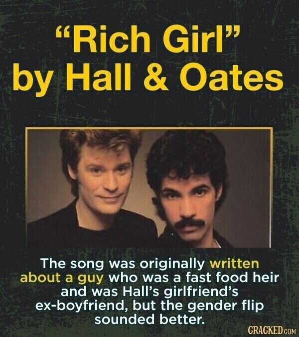
Well, maybe not all of them are your favorite songs, but an awful lot of straightforward songs that profess love or tell stories have origins and inspirations that might surprise you. In an obvious reaction to the Doc Pomus story from a couple of weeks ago, we get a trivia list about where those song ideas came from. It may have been a simple cultural or language difference that gave the song an entirely different meaning, like "...Baby One More Time," the song that put Britney Spears on the map. Or it may have been inspired by a person, and good luck figuring out who.
And there are some that were honestly pretty easy to figure out, llike "Sweet Caroline." But only if you were around at the time. Or if you were like me and made a living off of music trivia.
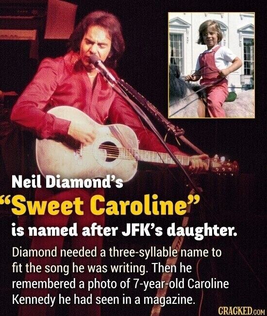
Read about 28 songs and where the ideas for them came from in a pictofacts list at Cracked.