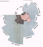
 We know Florence Nightingale as the founder of nursing as a profession, but she was also an accomplished statistician and graph maker. More importantly, she used statistical graphs to push for social change, particularly for the use of hygiene to improve health. After the Crimean War, she published a series of graphs in different forms to show that more soldiers died of disease than from battle, and more soldiers than civilians died of disease in peacetime. The graph forms are referred to as "bat's wing", "Lines," and "coxcomb" or "wedge."
However, it is the last graphic – the successor to the “bat’s wing” which I will call the “wedges” – that Nightingale is most famous for. Strangely enough, the name that many people give it is wrong. This graphic is not what Nightingale referred to as the “coxcomb”! In this diagram, Nightingale resolved the problem of the “bat’s wing” by using areas to represent the variation in the death rate, instead of the length of radial lines. The blue wedges, representing death by sickness, are far bigger than those representing wounds. The message of this graphic is twofold: first, most of the fatalities during the war were from sickness and second, improvements in hygiene dramatically reduced the death rate.
Link -via Metafilter See the full-size 1858 graph at Wikipedia.


http://dd.dynamicdiagrams.com/2008/01/nightingales-rose/
http://drvitelli.typepad.com/providentia/2011/03/the-bedridden-activist.html
http://drvitelli.typepad.com/providentia/2011/04/the-bedridden-activist-part-2.html