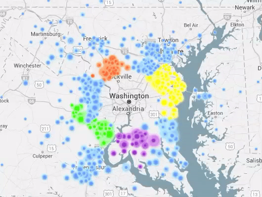
The Commute Map is an interactive graph that shows the flow of commuters in your area. Select a state and county, and whether you want to see the patterns for people who live there or for people who work there. Below the map, you'll see a list of counties where the traffic is coming from or going. You can even select the range, up to 300 miles. The commute to work in Washington, DC, is shown here; apparently no one travels to work in my county. Creator Mark Evans explains more about this visualization at I Like Big Bytes. -via Metafilter
it's neat anyway!
After some searching, I discovered that most places have a large exchange of people commuting in and out. Not so much for Orange County, CA (where I live). Apparently we stay close to home.